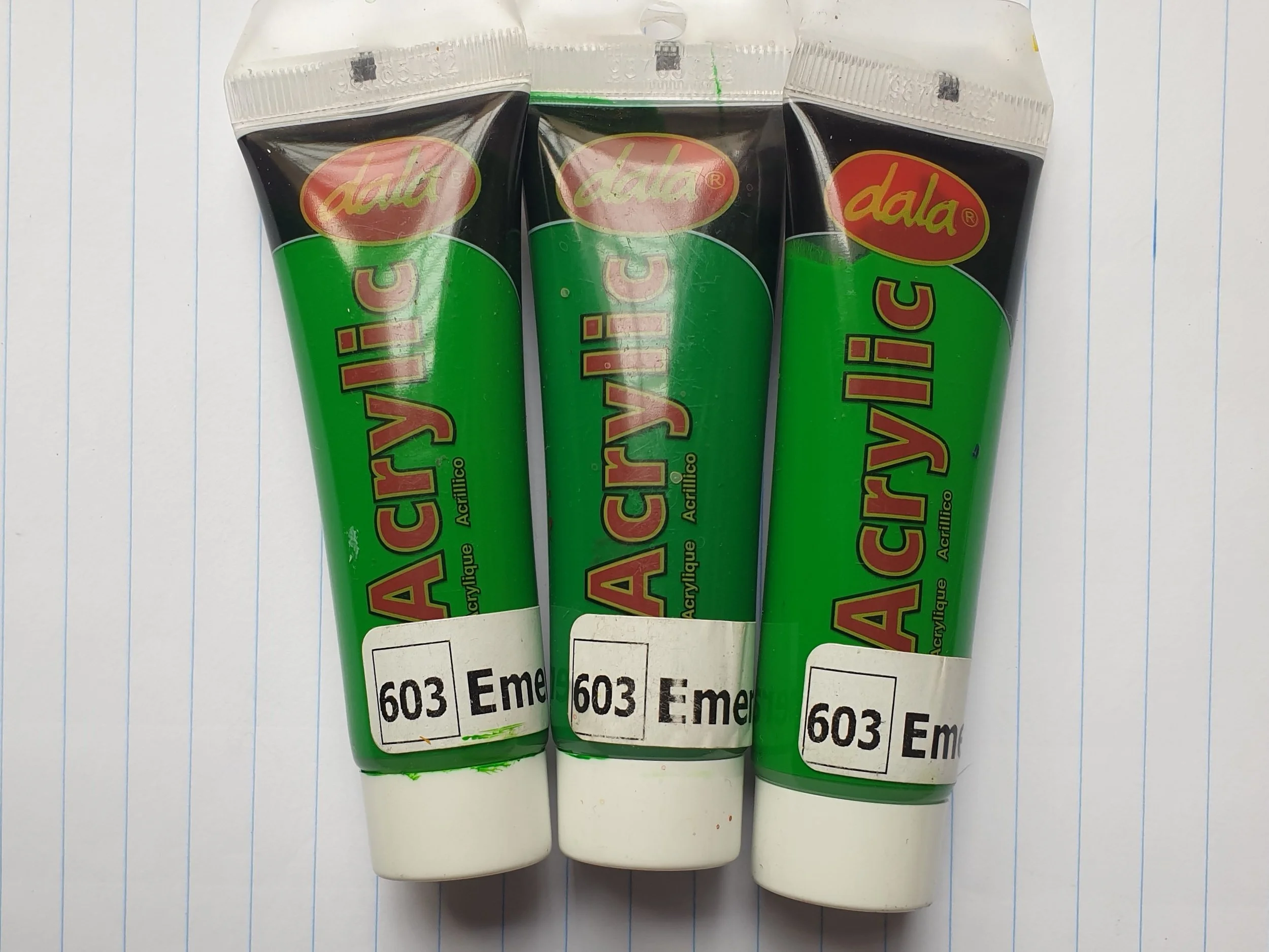
Dala Acrylics
Starting as KV Art Materials in 1992 this South African company rebranded as Dala in 1994. Their supplies are readily available and reasonably priced, with today's focus being on their acrylic paint which is used by many aspiring artists, art teachers and hobbyists throughout South Africa.
But how good is the paint really? Is it what you are looking for to use in your next art piece or project? Let’s take a look at some pros and cons.
Pros
Price - generally very reasonably priced.
Readily available.
Good variety of colours.
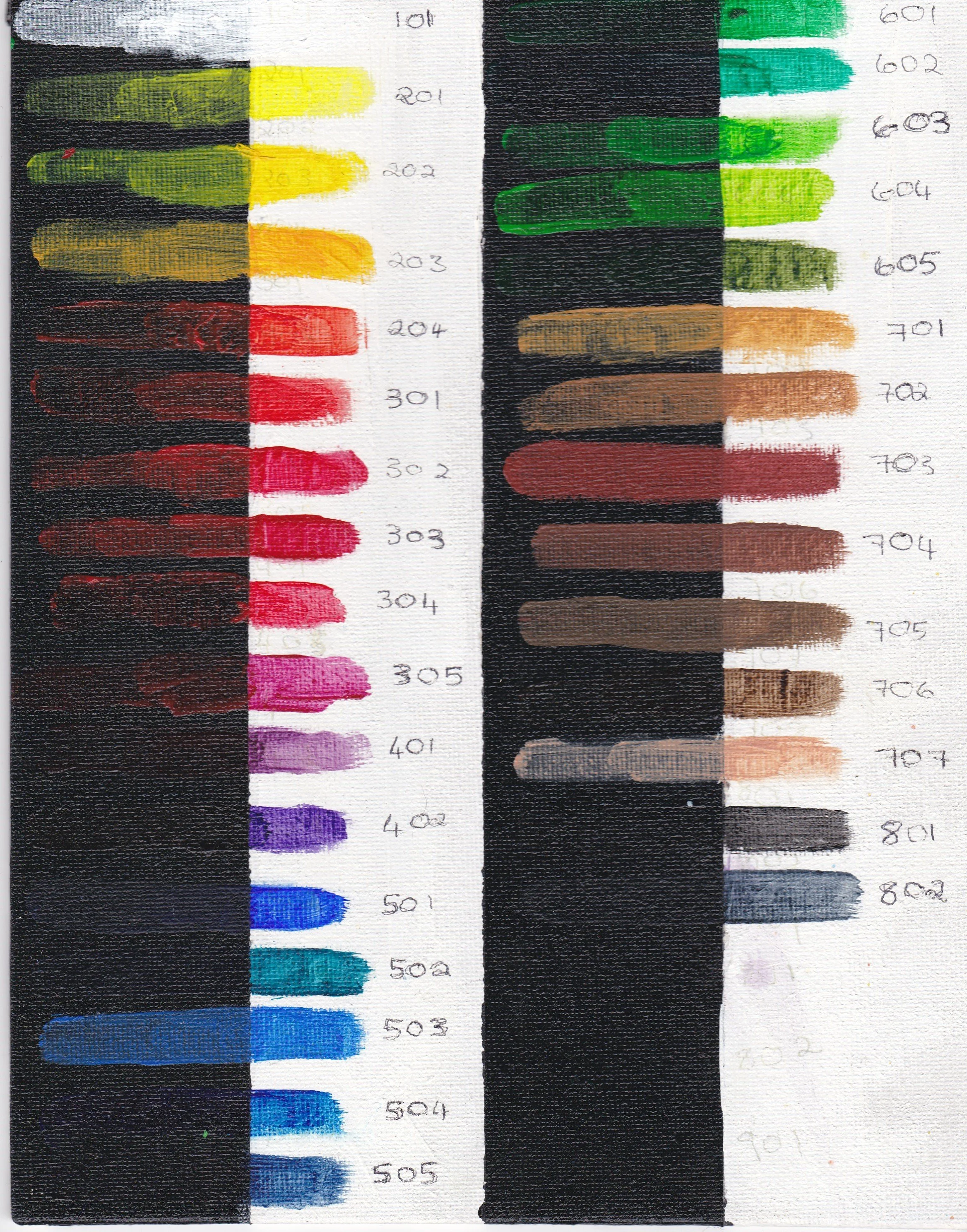
A fair amount of the colours are quite transparent which can be good when trying to create glazes or just adding a tint into another colour.
The colours mix easily and well with other brands.
The paint works and mixes well with other products from Dala like their mediums.
The tubes they are contained in are nice and sturdy, in my 7 years of using them I’ve only had 2 tubes where the end of the tube wasn’t sealed properly.
You are able to buy them in a variety of sizes, as singles or as part of a set.
Sticks nicely to the canvas.
The paint once dry is quite flexible.
Medium drying time.
Very forgiving to work with, can wipe it off and doesn’t stain the canvas too much if you’re quick. Easy to wash off your skin.
Cons
It forms a skin quickly which you can inadvertently pull off causing splotches if you don’t keep that in mind.
The transparency can also count against it if you’re looking for something more opaque.
Some colours are more glossy than others.
White isn’t very opaque.
Frequent inconsistency with the pigments and colours (see below for more detail).
Needs many layers to get a solid colour.
A few words on the transparency and opacity of the colours. Many of the colours like the lemon yellow need a much lighter base coat to get a nice bright shade. By needing to apply many layers you often end up with a thick area on your canvas and or very visible brush strokes.
Regarding the pigment inconsistencies.
I tend to have multiple tubes of the same colour due to the fact that I have multiple students. During this time I noticed that there seems to be inconsistencies in shades within the same colour, the most obvious of which was phthalo green (601) and emerald green (603).

Secondly, two of their colours, namely raw sienna (702) and burnt sienna (703), were prone to having visible streaks of red pigment in the tubes. If you happen to hit one of those particles of pigment unexpectedly you’d have a nice red streak on your canvas.

I raised these concerns a few years ago with the director who acknowledged the issue and confirmed they were looking to correct it. As of now I am not sure if all the changes have been implemented so be sure to inspect your tubes when purchasing carefully.
Final thoughts:
When trying to mix orange, use a lot more yellow than you think you need.
Check the tubes carefully before buying any for red streaks.
The transparency might work for you or drive you insane.
If you are a student or newly starting with acrylics, these are the ones for you.
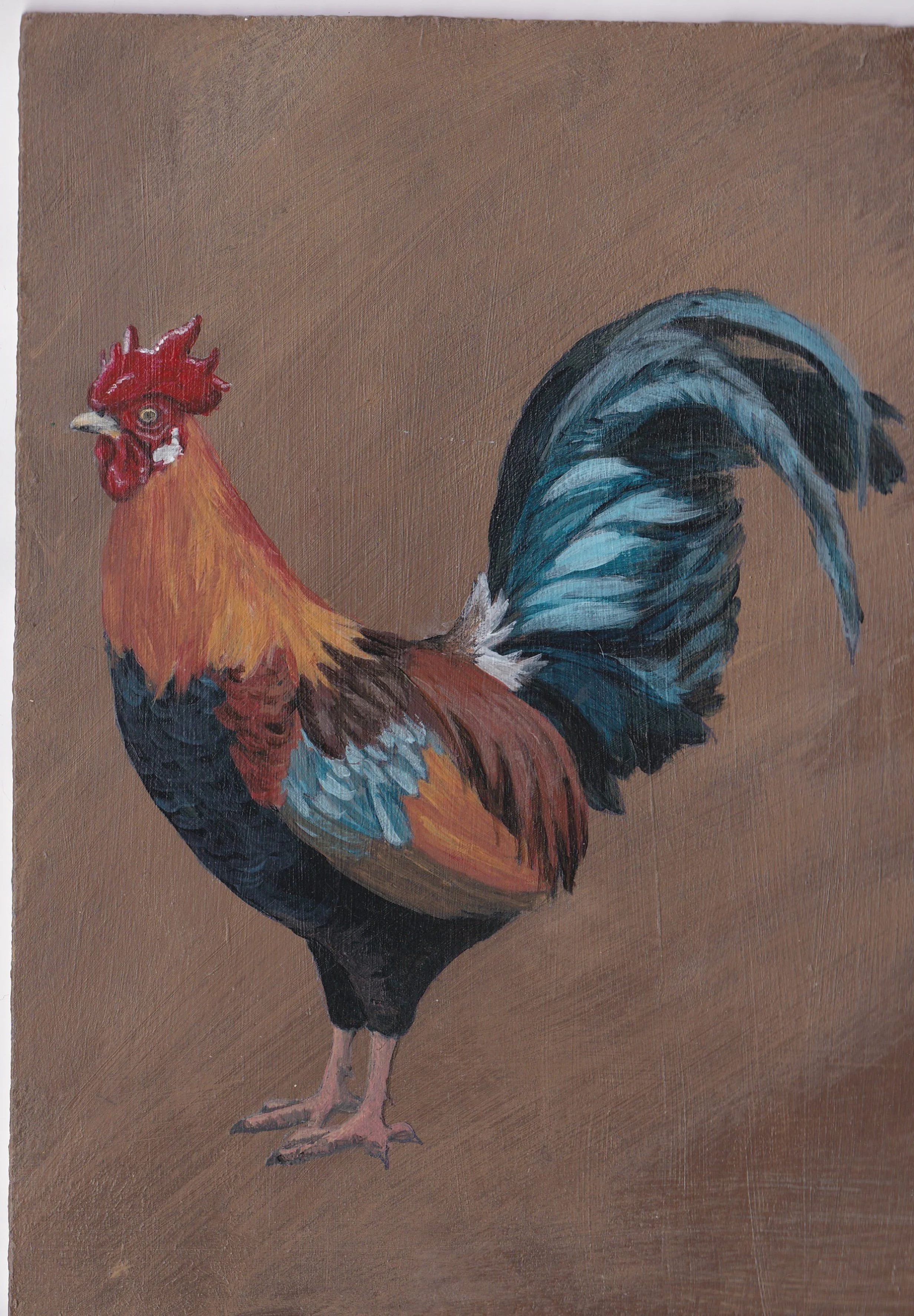
Rooster completed using Dala paints

Colour swatches
